Process Page
Keith Haring Process
Prior to this assignment I had already had a love for Keith Haring and his art work, I have always been a strong believer that art work doesn’t have to be explicitly complicated and full of detail to be considered a master piece and to me Haring’s work showed that. His simple yet iconic drawing caused for me to replicate “The Creation of Adam” painting but in Haring’s art style since I thought the idea would be a bit comedic and ironic since renaissance paintings are known for being full of details but Haring’s work would be the opposite of that.
I drew this piece on Procreate on my Ipad and used my Applepencil as my stylus.

First I created a simple shape for the platform in which the person to the left of the drawing would be laying on. I tried to keep the shapes simple since its common and essential to Haring’s work. And to replace the angels from “The Creation of Adam” I chose dogs instead of angels from the original. I did this because to me beside the artistic style in which Haring draws his people I also think the stylized way he draws dogs is iconic to his artwork. I did each dog on a separate layer just in case if I made a mistake I could erase it without ruining previous work and also because it would be easier for me to lasso that piece and move it as I please.

I then added in the people, trying to keep everything more rounded and simplified. I did this on a separate layer from the dogs and the platform. I also made sure to keep my sketch separated in colors by each layer so it would be easier for me to identify it.

I then outlined the entire drawing over my sketch, I lowered the opacity of my sketch layer when I outlined it in a different layer. This was to see my outline easier and to see how my final product was turning out. I then used the paint bucket tool in ‘Procreate’ to color each object, using vibrant colors signature to the Haring look. I also added plenty of lines surrounding my subject and lines coming from the dogs like Haring would to signify barking. Between the two reaching hands I also added a heart since Haring was all about sharing love so I wanted to incorporate that message into this art piece as well. Overall I think I did good, all though I think what I couldn’t quite replicate his good taste in color and his color palate, yet I think my drawing replicates his essence.
Body Photography Process
Before starting this assignment I was unsure of what body part I wanted to photograph however I ultimately chose hands mainly because they are seen in a day to day basis when going about your day and also I feel comfortable around hands compared to another body part. I wanted to show a story throughout this photograph because although body photography can be seen as a bit more stale in terms of emotion I think I wanted to show the opposite. Overall the final product taught me more about the power of editing and how important editing is, I felt that at the end of my editing process it added the emotion to this photo.


These were my friends which were models for this photography assignment, so this would be the behind the scene pictures.

This was the image I captured and liked the result of, I also decided to show the image to compare and contrast the before and after of the editing.

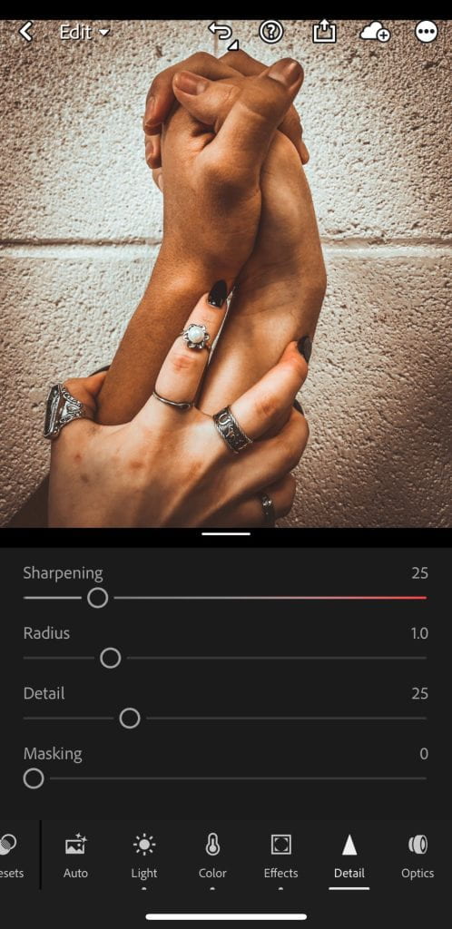
As soon as I captured a picture I was happy with, I took my image to light room mobile and chose to edit it there. I first decided to lower the exposure to bring out contrast and take away from the bright background. I then wanted to further more bump up the contrast to bring more emotion and to bring more definition to the texture of the hands. I also bumped up the shadows but also decided to lower the highlights and whites. All of this was to make the image darker overall. I decided to also higher the sharpening of the image to bring more texture and clarity to the hands.

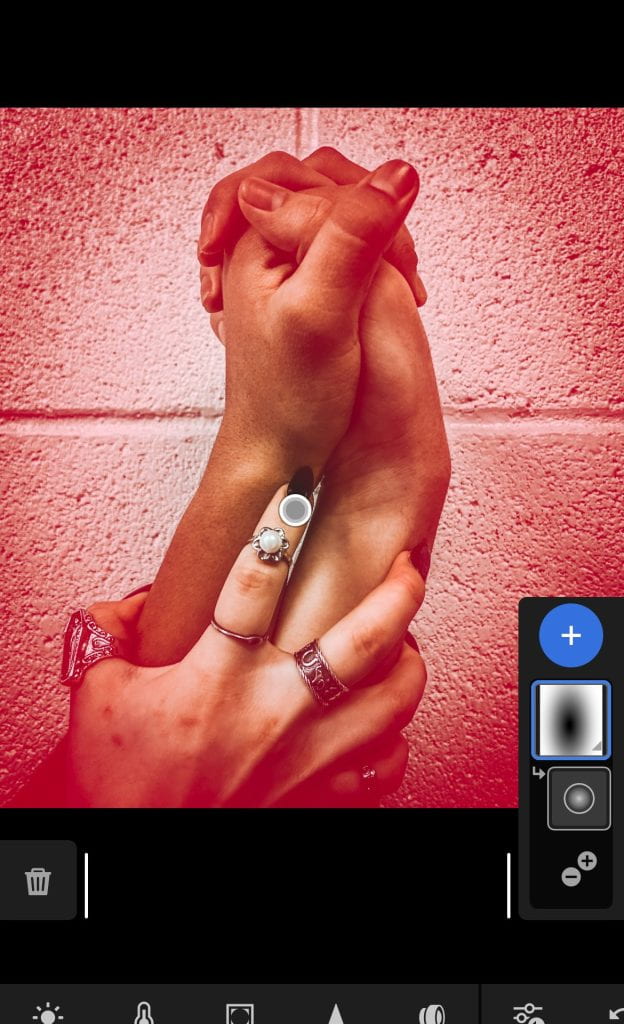
I also added a new layer to the image using the radial focus tool, using this took to give the hands the main focus.

Finally I cropped the image to set the focus on the hands cutting out any distractions, I also straightened the image to make it pleasing to the eye.
![]()
This was the final product of the image, after seeing how powerful the editing made this image it taught me the valuable skill of editing and how different color tones and different types of contrast can give an image a story. Although before the editing I already had a story for this image which was the theme of jealousy, however I think with the editing it contributed to that theme and story. I would be able to present this at the spring IB Exhibition by including it in a collage of sorts either focusing on body photography, emotion based photography, and or a dark contrast photography collage.
Statement piece Process
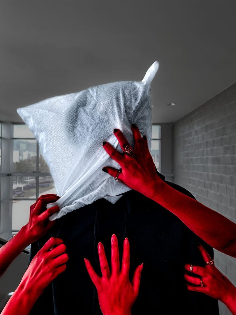
A statement piece is all about expressing an idea and or opinion, and for this assignment I wanted to tackle mental health. Mental health has always been important with me because I have struggled with depression so I wanted to make a piece that represented my feeling when going through depression. My first thoughts were hands, the hands I wanted them to be holding someone down similar to the way someone’s thoughts do. I felt that one of the things that affect mental health the most is your own thoughts, when struggling with depression I found that I always bought myself down the most. I also wanted the put a bag over the persons face not only because I didn’t want the focus to be on their looks but also because I found that when going through depression I suppressed my feelings and no one ever knew my feelings or what I was going through, its a jarring feeling.

The process behind this photo shoot was a team effort it required 3 people being the hands, and someone being the main center piece.
Step 1 editing

After capturing the image I took it to light room to edit it.

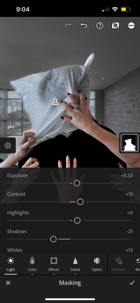
I then made a layer to mask the subject in when I then tweaked the background of the image, my goal when editing the background was to take the focus away from it and make it less distracting.

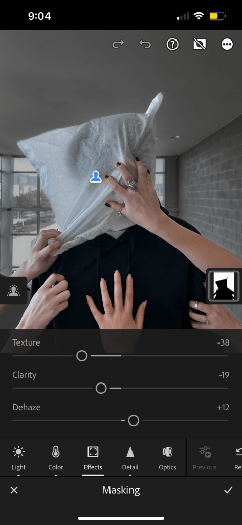
This was the after product once I edited the background. I took away saturation, lowered the exposure, and turned down the sharpness along with clarity. And on top of these settings I bumped up the noise. Another one of my objectives was to make it a bit darker to give it a more moody tone and sadder emotion to it. Hence the reason as to why I bumped up the shadows and lowered the highlights.

This was the final project after I edited the first layer which was the background.
Step 2 editing
My second step of editing was focusing on another layer of masking which is seen on the right side and is the second one listed (going from bottom to top). I decided to mask the subject themself.


In this masked layer I turned up the exposure and contrast along with taking away the shadows. My reasoning behind this was to make the subject stand out compared the boring dull background. I also bumped up the saturation in order to contrast it from the background since the background has no saturation.
Step 3 editing
I then masked a separate layer, focusing this layer on the hands.


I changed the hue of the hands a bright red, and bumped up the contrast and shadows to bring attention to the hands as well. I also lowered the exposure in order to make it a more crimson red.

This was the final product from the masking of the hands.
Step 4 editing
I then masked the subject, minus the hands, so mainly shifting my attention to the face of the subject.


I wanted to make the face contrasting from the hands so I made the white in the face a cooler blue tone. I also made it brighter to bring attention to the face as well.
The final product
Screen Print Assignment
The definition of screen print would be “force ink or metal on to (a surface) through a prepared screen of fine material so as to create a picture or pattern.”
So for this assignment my job was to choose a design of my liking and learn the steps of transferring that image to a sort of fabric whether that be a shirt or tote bag.
Step 1 Choosing the image
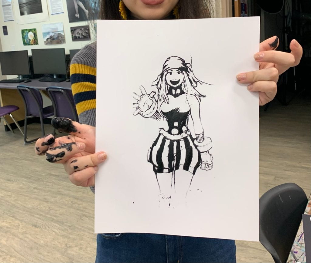
So when choosing my image I was very mindful of what I wanted my design to be since everyone gets one screen per person. I ultimately decided on a cartoon character I really like who never has any merchandise of herself since she’s a very minor character from her respected series and appears in only about 2 or 3 episodes.

Here is the image I chose as my design.
I then took the image onto photoshop in where I then used the adjustment setting and went onto threshold until I got a clear black and white image I liked. When doing this part on photoshop I had to be mindful that the black of the image would be the color of the ink on my final product. I also went in with the brush tool to thicken her outline.

The threshold final product.
Step 2 Screen coating
After I had a design prepared it was now time to coat a screen. The screen was made out of this silk material meaning it was very delicate. Our first step to this was to use a spoon to fill up this slider with chemical in which I then coated both sides evenly with the chemical.


Your final product should be a fully coated screen where the chemical is a somewhat thin layer. You want a think layer so that in the next step your image actually burns through and there are no bubbles, since an excessive thick layer will dry and bubbles will rise to the surface.

This is what the screen looks like once its fully coated. And once you have a fully coated screen I left for the chemical to dry for 24 hours in a dark area along with making sure nothing touches the chemical, I chose a cabinet to store mine.
Step 3 Burning the image
The next step was to burn the image onto your screen. Firstly you take your threshold design and transfer it to a sheet of plastic like paper.

Keeping in mind once again that the black parts will be the color of your ink.
Once you have this, you place this onto your now dried screen under harsh lights and leave it there for 18 minutes without moving it at all. Keep in mind you should probably flip the image since the final product will be mirrored of the original way you placed it onto the screen to burn. After those 18 minutes have passed you take a wet rag and rub the screen until your image starts to appear clearer. It should be to the point where you can see through your screen.
![]()

Ultimately this is what the image should look like after it is burned onto the screen and washed with the rag.
Step 4 The actual printing process
Once you have a printed screen you are now ready to add ink and transfer the image onto a surface. Put ink on the bottom of the screen and then have a second person hold the screen down so it doesnt move. You should then use a squegee to slide the ink from top to bottom of the screen.

Here you can see the ink piled at the bottom ready to be spread around.
Here is a test run I did on a piece of paper, which I recommend doing first before transferring onto your final piece.
After the initial test run I transferred my image onto a tote bag for my final result.

Here was the final product!
Reflection
Overall screen printing was a very tedious and time consuming thing there is much room for mistakes when doing this. I think however the result is worth it! A couple mistake worth mentioning was when I first coated my screen it was too thick and it resulted in bubbles in my coated screen. And when transferring my mage to my tote bag I didn’t do enough pass overs resulting in a more faded image.
Recreation Assignment

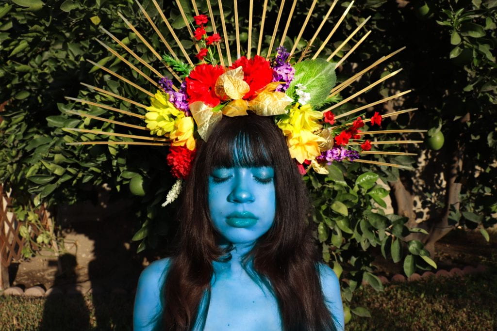
The picture I decided to recreate was a piece by artist David Lachapelle titled, “Blue God”. The picture includes a guy depicted as a god painted blue with a calm expression. In which it inspired me for its vivid colors and the halo crown caught my attention as well.
When making this picture I had a saint halo prop in which I had already made for a previous shoot. To make this saint crown I used a headband in which I used zipties all around it to create the rays coming out of the head band. I painted the zipties gold with multiple layers of gold acrylic paint. And to finish this headband up I hot glued flowers on and make paper roses to fill in extra spaces.
Saints halo prop pictures
Zipties underneath the headband
Closer look at the glued on flowers
To start off I used a tripod and my digital camera to take the self-portrait. In which I made sure I had a self-timer on as well.

To the left you can see the shadow of the tripod


After getting a couple of shots I took this to light room in which I edited the background and messed around with the settings, like contrast and exposure. I used the adobe light room masking tool in order to make myself blue.
To the right you can see my settings and editing I did, each layer has different editing.
This was the finished product from the light room portion of this photo process.

After a good while of editing, I took this picture onto adobe photoshop in where I started to fix the background with the lasso and copy tool, each of the layers are cut out pieces of the already existing background where I just copied and pasted them to fill the background up completely with the tree leaves, to match the original photo by Lachapelle.
Next to add more contour to my face and give it an airbrushed goddess effect I used lots of the dodge and burn tool to add highlight and contour to the shape of my face. I also used the dodge took to highlight the saints crown a bit.
The final product

The final product has an airbrushed feel to it which I really liked and overall I am happy with the results.
Surrealism Assignment
My inspiration behind the design was actually a small porcelain doll my brother has in shape of a bread. From there I took the idea into a more surrealistic take and gave it human eyes and a pair of legs. My idea of the piece was if breakfast ate us instead of us eating breakfast. So in the bowl you see lots of tiny human, almost like tiny human cereal. The message behind the piece is humans tend to not think of the fact humans have evolved to the point where we’re at the top and nothing can touch us. This planets fierce animals could be taken down by humans with weapons we created. So in this piece I made these breakfast objects huge and untouchable. I also gave them no mouth because it reflects on the fact that the people who run the world (politicians) leave us in the dark and never really tell us what’s going on in the world.

Block Printing
For my block printing design I picked a pokemon called Mimikyu. I picked it because I like the design of it and I also really enjoy the Pokemon franchise and their games. I also like the design behind Mimikyu which is, Mimikyu is a Pokemon which dresses up as Pikachu because they want to be as loved as pikachu.

Here was my process when it came to block printing. It started off as a vision, but yet when it came to the carving process I was struggling. I wanted to carve in deep enough that way the details don’t get covered by ink when applying the ink but yet the more I carved in the more details started to become rough. On my first test run with the blue ink it came out better than expected, the shape is there but the details weren’t too refined as I wished they were. When I stamped my design on my painted wood slap I had a technical issue where my stamp slid and blurred the design. So I had to render the design in the last bottom left picture I added a second coat and that was the beginning of my rendering.

In this image we have the final result. Overall I think my stamp was a bit of a failure but I enjoyed using the stamp a base for my painting. I ended up going over my stamp painting multiple times, and added some more painting details. Like adding a dry brush texture to add a glow like texture.
Here is an image of me!
